Creating a peaceful and calming environment in your home starts with the colors you choose for your walls, furniture, and accessories. Calm colors can help reduce stress, promote relaxation, and make your living spaces feel more inviting. If you’re looking to refresh your home with soothing hues but aren’t sure where to start, this guide will walk you through practical tips for choosing calm colors that suit your style and needs.
Why Choose Calm Colors?
Calm colors are typically soft, muted tones that create a sense of tranquility. They encourage relaxation and can make your home feel like a retreat from the busy, noisy world outside. Whether you want to unwind after a long day or create a gentle atmosphere for family and guests, calm colors play an essential role.
Common calm color families include:
– Light blues and greens
– Soft neutrals like beige, cream, and taupe
– Gentle grays
– Pastel tones
Choosing the right calm colors is about balancing beauty with comfort, so your space feels both stylish and peaceful.
Tips for Choosing Calm Colors for Your Home
1. Consider the Purpose of Each Room
Before selecting colors, think about the primary use for each space:
– Bedrooms: Ideal for soft blues, lavenders, or muted greens to promote rest.
– Living rooms: Warm neutrals or gentle earth tones encourage relaxation and socializing.
– Bathrooms: Light blues or sea greens evoke cleanliness and calm.
– Home offices: Use subtle greens or grays for focus without stress.
Matching the color to the room’s function ensures the atmosphere feels right.
2. Use Color Samples and Test Patches
Colors can look very different depending on lighting and surrounding décor. Always test paint samples on your walls or use large swatches before committing. Observe how the color looks throughout the day, both in natural and artificial light.
3. Start with a Neutral Base
Neutral shades like white, beige, or soft gray provide a peaceful and versatile background. They work well paired with other calm colors and allow you to change accent colors easily over time.
4. Incorporate Nature-Inspired Hues
Colors inspired by nature often evoke calmness. Think of soft sky-blue, leafy greens, sandy beiges, and gentle stone grays. These tones can create a harmonious connection with the outdoors, which is naturally relaxing.
5. Balance Warm and Cool Tones
Calm colors can be either warm or cool. Cool colors like blues and greens feel refreshing, while warm neutrals and pastel yellows feel cozy. Mixing these tones carefully can create balance. For example, pairing soft blue walls with warm beige furniture keeps spaces from feeling too cold.
6. Use Matte or Satin Finishes
Glossy paints can feel flashy and may reflect too much light, disrupting the calmness. Matte or satin finishes diffuse light softly and add to a soothing atmosphere.
7. Add Texture and Layers with Calm Colors
Using calm colors in combination with different textures—like woven fabrics, natural wood, and plush rugs—adds depth without overwhelming the eye. This layering makes the space feel cozy and inviting.
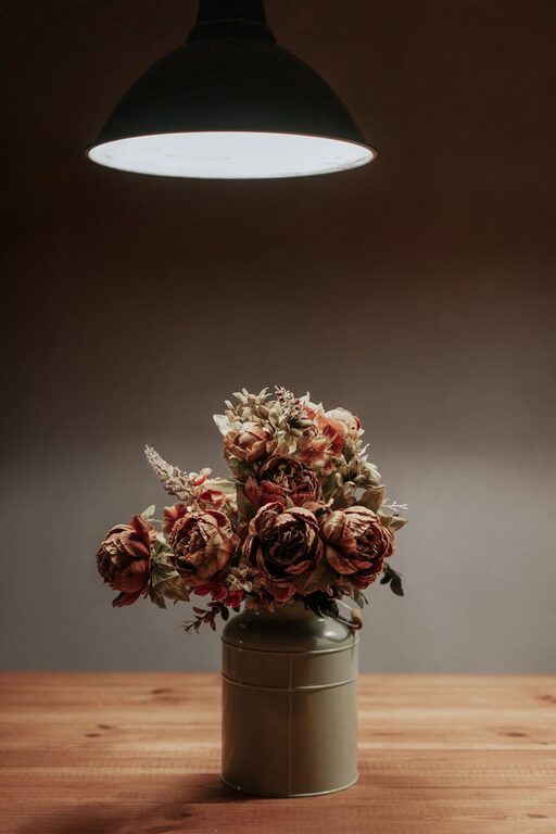
8. Limit Bold Accents
While calm colors dominate, using small pops of stronger colors in accessories like pillows, art, or vases can add personality without disturbing the peaceful vibe. Stick to muted or pastel versions of your accent colors for harmony.
9. Consider Color Psychology
Certain colors have psychological associations:
– Blue: Calm, trustworthy, peaceful
– Green: Restful, refreshing, balanced
– Lavender: Relaxing, gentle, soothing
– Beige: Warmth, simplicity, neutrality
Choosing colors aligned with the feelings you want to enhance can support your goals for a calm home.
10. Coordinate with Existing Décor
If you’re not starting from scratch, consider how your calm colors will work with furniture, flooring, and decor items already in place. Aim for complementary colors to create cohesion.
Popular Calm Color Palettes to Explore
Here are a few calming color combinations to inspire your choices:
– Soft Blue, White, and Light Gray: Timeless and soothing, great for bedrooms or bathrooms.
– Sage Green, Cream, and Warm Wood Tones: Earthy and natural, perfect for living rooms.
– Lavender, Pale Pink, and Light Beige: Especially calming and welcoming for bedrooms or cozy corners.
– Muted Taupe, Soft Coral, and Ivory: A warm and gentle palette for versatile living spaces.
Final Thoughts
Choosing calm colors is a wonderful way to transform your home into a sanctuary of relaxation. By understanding the function of your rooms, testing samples, and combining hues thoughtfully, you can create environments that make you feel peaceful and comfortable every day. Remember, the best calm colors are those that resonate with your personal taste, so don’t be afraid to experiment gently until you find the perfect shades that make your home truly your own.
Creating a calm space is a journey—enjoy the process as you watch your home become a more serene and welcoming place.
—
Feel free to revisit your color choices over time, and don’t hesitate to refresh your palette as your tastes evolve. A calm home is always a work in progress!